
Section 1
CSS A Master Class
CSS REFRESHER Intro
When the web started, monitors were all fairly similar. Even when CSS was created and implemented, the way people viewed websites was still quite similar.
Because of this, CSS was designed to have features similar to print and newspaper layouts and many things were set by pixel size and the goal was to have a design be 'pixel perfect'
As monitor technology improved, more widths and sizes became available. Browser technology also advanced in many ways, including allowing for browsers to be resized to nearly any size. Finally, mobile devices were introduced that were not only much smaller than a typical monitor, they also had two possible orientations.
Can I use?
As new technologies arise in HTML and CSS, some browsers are faster to adopt them than others. In the past, IE was often the least able to adapt changes.
To check whether a certain feature is compatible in a browser, we can check a web site called Can I use
Let's search for flexbox (you'll learn about it in a later lesson). As you can see it is fully compatible in all browsers except for IE, where it is partially supported.
Should I Prefix?
If you find a feature that is not supported, or not fully supported, you can go to Should I Prefix
There is a list of CSS features that either no longer require a prefix (coded in green). Or are in blue. If they are blue, you can expand them and see how you would write the vendor prefixes, so you can have compatibility across browsers.
Things are always changing, but right now a feature called appearance requires vendor prefixing. You can see an example below.
For the appearance feature, you would write the property three times. Two times would include the vendor prefix so that it can be used in different browsers.
As you look at older code, you may see vendor prefixes for features that no longer require it. It's ok! It won't break anything. But you won't need to include those vendor prefixes on new work.

You can also use a CSS prefixer to write the prefixes for you, then just copy paste Pleaeease.io
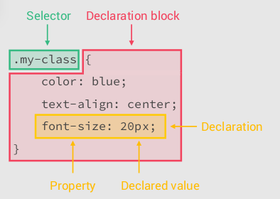
How CSS works
The breakdown of a CSS Selector
How CSS is read by the browser
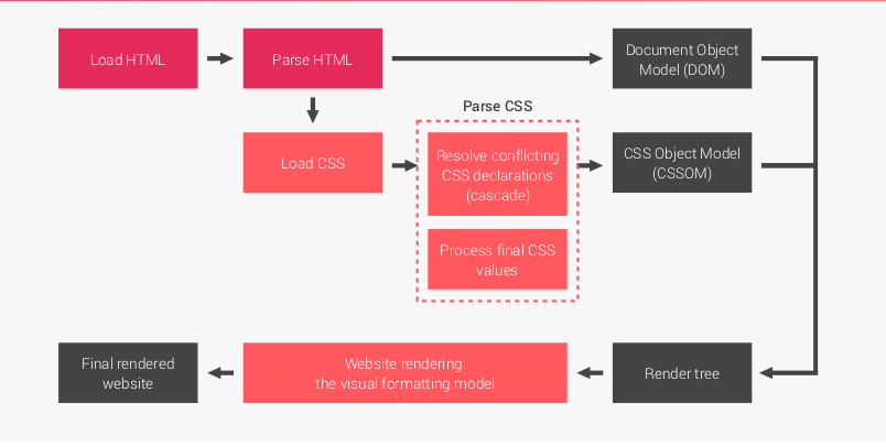
When a webpage is loaded in the browser first the page is loaded, then
the html page is parsed, then the css is loaded and the Dom is created ( more on the Dom next week),
then the CSS is Parsed and the browser decides how to resolve conflicting CSS and processes final values,
Once that happens we then create the CSS Object Model, then we get the render tree, then we render the website with the visual formatting model,
Then we get our website.
Forget Everything I just Said
- You don't need to understand all of that to write good CSS
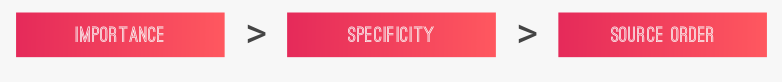
- Main takeaway is this , the CSS gets parsed and resolves conflicts between your styles
- The way css figures out what CSS should be valued as more important is know as CSS Selector Specificity
- Specificity is what you need to understand
Specificity Broken Down
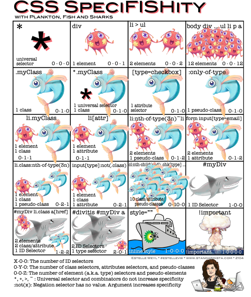
Specificity: How it works
- 0-0-0: Global selector
- 1-0-0: ID selector
- 0-1-0: Class selector (Also attribute selector & pseudoclass)
- 0-0-1: Element Selector
- Descendant Selector Combinator (' ')
- Child Selector Combinator ('>')
- Sibling Selector Combinator ('~')
- Adjacent Sibling Selector Combinator ('+')
| Selector | Example | Description |
|---|---|---|
| element element | div p | Selects all <p> elements inside <div> elements |
| element > element | div > p | Selects all <p> elements where the parent is a <div> element |
| element + element | div + p | Selects the first <p> element that are placed immediately after <div> elements |
| element ~ element | p ~ ul | Selects every <ul> element that are preceded by a <p> element |
Specificity: The less than obvious
The * selector, or global selector, has a specifity of 0.

Combinators, like ~, >, space, and + have no value

ul li {} 0-0-2
ul > li {} 0-0-2
:not has no value, but parameter selector does
Lets write some Code and experiment with this
- Go to repl.it instead of JS we will now use it to write some HTML & CSS together with our JS
- Lets play with specifity
- Use document.querySelector
- Display an object in the browser
- Descendant Selector Combinator (' ')
- Child Selector Combinator ('>')
- Sibling Selector Combinator ('~')
-
Adjacent Sibling Selector Combinator ('+')
The Box Model
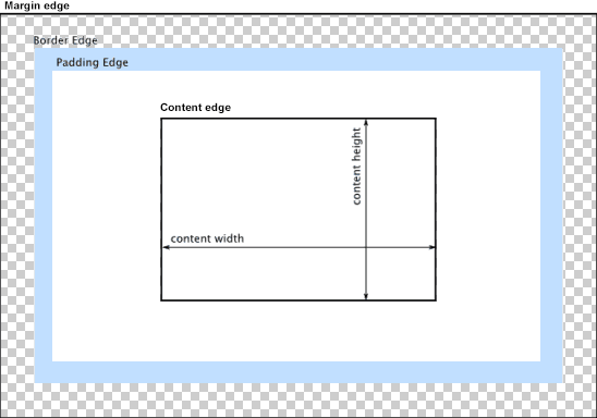
Content area
The content area, bounded by the content edge, contains the "real" content of the element, such as text, an image, or a video player. Its dimensions are the content width (or content-box width) and the content height (or content-box height). It often has a background color or background image.
If the box-sizing property is set to content-box (default) and if the element is a block element, the content area's size can be explicitly defined with the width, min-width, max-width, height, min-height, and max-height properties.
Padding area
The padding area, bounded by the padding edge, extends the content area to include the element's padding. Its dimensions are the padding-box width and the padding-box height.
The thickness of the padding is determined by the padding-top, padding-right, padding-bottom, padding-left, and shorthand padding properties.
Border area
The border area, bounded by the border edge, extends the padding area to include the element's borders. Its dimensions are the border-box width and the border-box height.
The thickness of the borders are determined by the border-width and shorthand border properties. If the box-sizing property is set to border-box, the border area's size can be explicitly defined with the width, min-width, max-width, height, min-height, and max-height properties. When there is a background (background-color or background-image) set on a box, it extends to the outer edge of the border (i.e. extends underneath the border in z-ordering). This default behavior can be altered with the background-clip CSS property.
Margin area
The margin area, bounded by the margin edge, extends the border area to include an empty area used to separate the element from its neighbors. Its dimensions are the margin-box width and the margin-box height.
The size of the margin area is determined by the margin-top, margin-right, margin-bottom, margin-left, and shorthand margin properties. When margin collapsing occurs, the margin area is not clearly defined since margins are shared between boxes.
Finally, note that for non-replaced inline elements, the amount of space taken up (the contribution to the height of the line) is determined by the line-height property, even though the borders and padding are still displayed around the content.
Lets write some Code and experiment with this
- Go to repl.it instead of JS we will now use it to write some HTML & CSS together with our JS
- Lets play with specifity
- Use document.querySelector
- Display an object in the browser
References: